Tour
Welcome to the tour of Polynote's UI!
Polynote takes its inspiration from IDE-like tools, bringing a rich UI into the notebook experience.
The Polynote UI
Here, we'll go over the various parts of the UI briefly, and then drill down on each later in the tour.
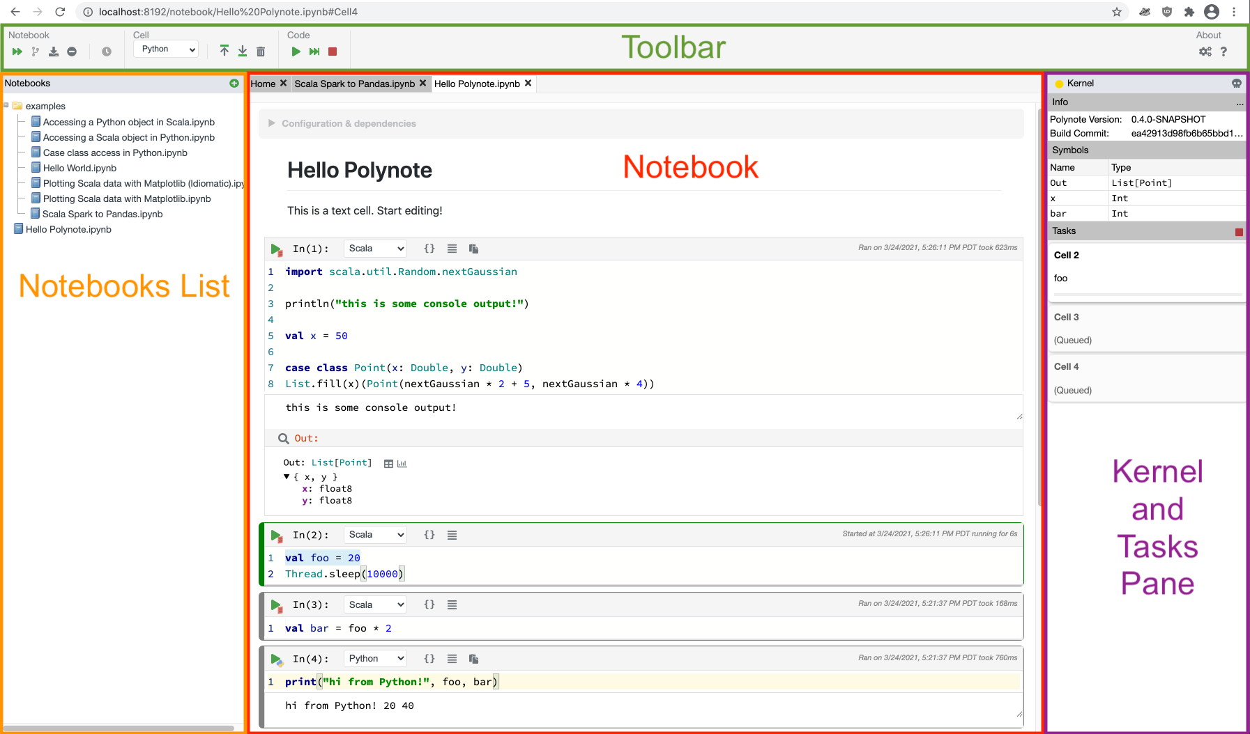
This screenshot divides the UI into four sections:
- The Toolbar at the top, which collects buttons for interaction with the notebook
- The left Pane, which offers easy access to a file-like browser showing the notebooks in Polynote's workspace, a table of contents showing the headings in your current notebook, and a search button to search all of Polynote's notebooks.
- The Kernel Pane on the right, which shows the current state of the notebook.
- The Notebook section itself in the middle, which displays the actual notebook.
The above sections provide details about the specific functionality of each part of the UI.
Panes in Polynote
Before you go learn more about the specifics, let's just talk about how the two panes work.
Panes can be collapsed
If you'd like more horizontal space to see the Notebook section, you can collapse one or both of the panes.
Simply click on any empty space on the header, and the pane will collapse to the side. Click the title of the header
(for example, Kernel if you have collapsed the Kernel Pane) in order to expand the pane again.
Panes can be resized
If you want more room for the Notebook but don't want to hide a pane entirely, you can resize a pane by dragging it.
Tip
Polynote remembers your pane collapse and size preferences in your browser's local storage.
As long as you're using Polynote with the same browser, your customizations should be persisted!
Next up, learn about the Toolbar.